Creating Android menu icons with Inkscape
I’ve spent a few weeks writing a feed reader for Android, Weader and wanted to have nice little menu icons for every possible choice. Android comes with a bunch of standard icons in the SDK and it’s probably a good idea to use them to begin with so that an application will fit the standard Android look. But I needed a few more icons.
I tried to find some instructions about how to create icons that look like the standard menu icons but the information on the Android developer pages about iconography was rather brief and in some cases flat out wrong. The offical pages say that icons meant for a black background should be use color #ffffff with 80% opacity which is just plain wrong, if you try to do that any white parts will end up being too bright and what to do about black areas in your icons?
After a bit of reverse engineering of the existing icons, writing a bit of Python Imaging Library code to extract the alpha layer, poking at the pictures with Gimp and a lot of fiddling around in Inkscape I finally managed to produce a couple of icons that I’m fairly happy with. So to spare anyone else the same problems, here’s how I finally generated my icons.
Icons in Android must be PNG files and they should be provided in multiple sizes to fit devices with different screen resolutions. The “active area” is the area that should be covered by the actual objects in the icon, there is supposed to be a bit of empty space around.
| Resolution | DPI | Icon Size | Active Area |
|---|---|---|---|
| ldpi | 120 | 24x24 | 18x18 |
| mdpi | 160 | 32x32 | 24x24 |
| hdpi | 240 | 48x48 | 36x36 |
| xhdpi | 320 | 64x64 | 48x48 |
| xxhdpi | 480 | 96x96 | 72x72 |
Actually, the ldpi icons in Android seem to be 36x36 which is strange since if I calculate the proper size based on the DPI it comes out as 24x24. Anyway nobody uses ldpi any more so I’ll just ignore that and use 24x24.
Inkscape’s native file format is SVG, Scalable Vector Graphics, which is an open standard for vector graphics, so that is the format I’ll use. The resolution for SVG files is hardcoded to 90 DPI (dots per inch). This doesn’t match the Android resolutions very well, I just decided to pretend I did everything in the hdpi resolution then fix things ups when exporting an image in PNG format later on.
So, here’s what I did.
First I created a new image in Inkscape and then selected File -> Document Properties and set the image size to 48x48 pixels to match the menu icon size for the Android hdpi resolution:
To make things a bit easier for me I switched to the Grid tab and set up a 1x1 pixel grid with major lines every 8 pixels. Time to start drawing:
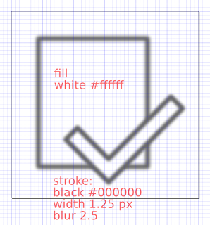
I needed quite a bit of experimentation to get about the same line weight and color as the stock Android icons, but finally managed to get something that looks decent.
Select the Object -> Fill And Stroke menu. Set the fill to white (#ffffff) and the stroke to black (#000000) and then select a stroke width of 1.25 pixels and a blur factor of 2.5.
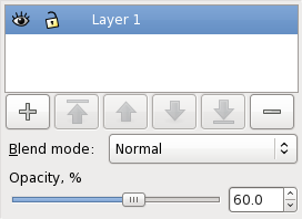
The final touch is to set the layer opacity to 60%.
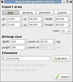
Export the drawing using File -> Export Bitmap. First press the Page button to use the page boundaries as the limits for the bitmap and then set the size to the icon size you want, in my case I chose 48x48 pixels for hdpi. And then press export to create the bitmap.
It’s possible to use Inkscape from the command line to automate the creation of the PNG files. Put the SVG file in a directory called “art” in the project and then run the following shell script:
while read dir dpi; do
    inkscape --export-area-page --export-dpi=$dpi --export-png=$dir/ic_check.png ic_check.svg
done <<EOF
../res/drawable-ldpi 45
../res/drawable-mdpi 60
../res/drawable-hdpi 90
../res/drawable-xhdpi 120
EOF
The trick here is to use the correct resolution. Since the SVG file is in 90 DPI and is drawn for the hdpi resolution, I just have to scale the requested resolution to get the correct PNG image size. This trick also means that I an use the same script for my launcher icon which is supposed to be 72x72 pixels in hdpi. Draw it at that size in Inkscape and it will automatically be exported at the correct sizes for a launcher icon.
So here’s the result, ldpi, mdpi, hdpi and xhdpi icons. The top row are my new icons, the bottom row are the original Android icons.
The other icons are very, not perfect, but they’ll do. I am a bit confused though, the image here was composed in Gimp and the colors look quite different. When I tested this on an actual Android device the color for the white part of the icon was identical. And as you can see, the ldpi icon in stock android is completely different, it’s using the pre-Honeycomb style for icons, but I’ll ignore that and use the same theme for all different resolutions of my icons.
Trying to create an icon which is identical to an existing android icon is probably a bit unnecessary, but the nice thing about having a nice little icon in SVG format is that it’s very easy to modify it to create the extra icons I needed in my application, all with the same look and feel.
By the way, as you can probably guess, the icons are used to mark articles as read or unread. I’m not totally happy with these symbols, the check mark and the cross don’t feel right, on the other hand I can’t come up with any better ones. If you have any ideas for icons that might fit better, please drop me a line, I’m always open for suggestions.


